
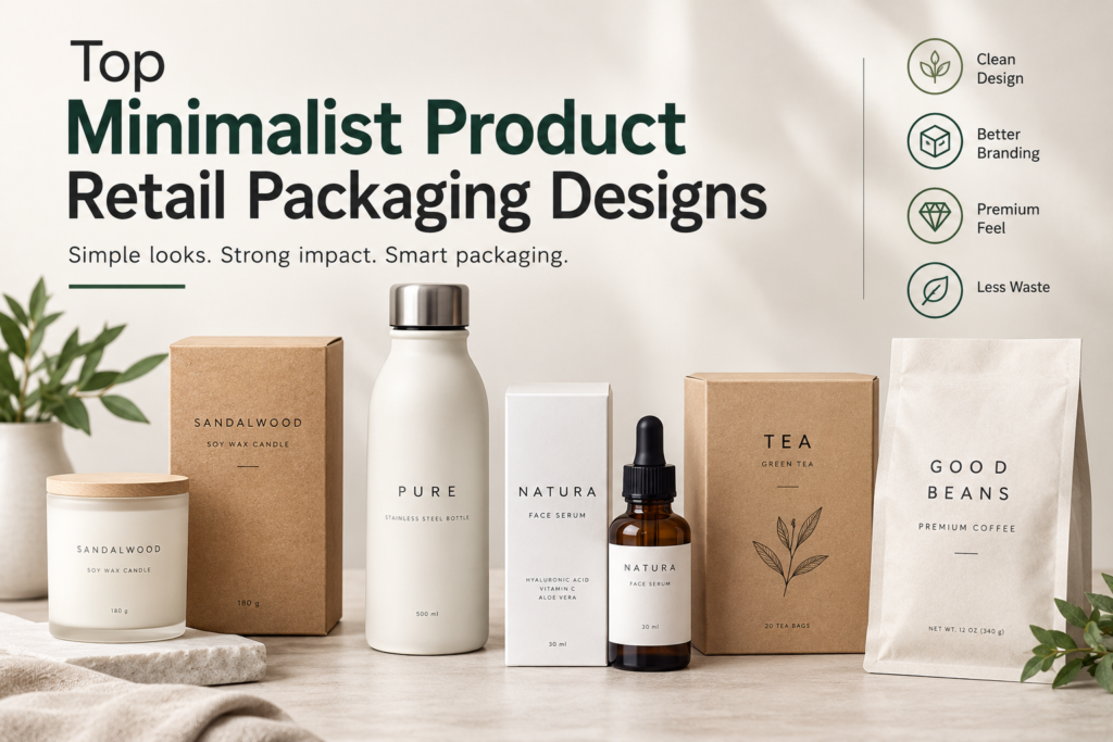
At ProPackInsights, minimalist packaging design is one of only a handful of concepts that have retained popularity despite the cyclical nature of the industry at large — it has proven itself as an expectation in certain categories such as skincare, household products, and premium foods. However, minimalist extends to many visual directions, and the kind of minimalist packaging that has worked wonders for a perfume brand may be an odd fit for a household cleaner. Below are 9 distinct minimalist styles in use in the current retail landscape, followed by recommendations on what would complement the needs of your specific product.
9 Standout Minimalist Packaging Design Styles
1. Monochrome + Single Accent Design
This packaging design style emphasizes a dominant base color that is offset by a single additional element, often the brand’s logo. Because it simplifies the eye’s search for brand information, this style photographs exceptionally well for the growing online retail space where product shots replace a physical interaction with the box or jar that might have been had in a boutique. In addition, this style is one of the easiest to scale, as a similar base-accent structure can be applied across dozens of SKUs without having to rethink the visual grammar for each new product.
2. Negative Space Design
In this minimalist packaging design, the negative space (the empty areas around and within product graphics) is the intentional design element, with the product’s small logo centered within a vast stretch of the box’s surface. Done right, this creates an impression of assurance in the product, whereas an improperly executed empty space design can make the product appear lazy.
3. Kraft + Natural Material Design
This packaging style emphasizes the material of the product’s presentation (often uncoated kraft or recycled fiberboard) over ink-heavy designs. The use of kraft itself is rising, particularly in the food and personal care sectors, as its implicit sustainability appeal resonates well with environmentally conscious buyers. Additionally, kraft tends to hold up well on shelves (unlike a glossy coating that may pick up fingerprints after weeks of being in a boutique), reducing the risk of an appearance of age or damage from handling.
4. Transparent Minimalism
A transparent package or panel allows the product to draw attention to itself (the other side of showing off the product is that it can easily become lost among surrounding products on a shelf). This minimalist style is useful for products that have an appearance that suggests quality, such as loose-leaf teas, bath products, and anything that has a particularly appealing color.
5. Logo-Forward Minimalism
A minimalist packaging design that emphasizes a single, large logo as the only design element. This approach leans on the brand presence of the mark, making it a good fit for well-established logos that have stood the test of time, as a new or unestablished mark might appear lazy in its minimalist presentation.
6. Typography-Led Minimalism
This minimalist packaging design style replaces brand graphics and product photography with typography. It is most commonly seen in direct-to-consumer brands that value textual presentation over a more traditional pictorial approach.
7. Textured Matte Minimalism
Embossing, debossing, or matte laminating can add a layer of quality to a packaging piece, especially when the design itself does not use much ink or print-heavy graphics. This is actually the area where most minimalist luxury packaging design takes place, as the visual restraint is balanced out by the feel of the paper. It is also a style that photographs less impressively than others on this list, which is why it performs better with products that have a tactile component (in-store cosmetics or specialty foods) rather than being purchased based on the appearance of the product in a photo on a website.
8. Single Line Illustration Minimalism
Rather than a full illustration or pattern, a minimalist packaging piece may use a single continuous line drawing (botanical, abstract, or otherwise) as its sole illustrative element. This approach has been particularly popular in the wellness and beauty spheres for emphasizing craftsmanship without overshadowing the product’s branding.
9. Foil-Accent Luxury Minimalism
A minimalist approach that uses a single foil element (gold, copper, or otherwise) to offset a base design that is often dark or saturated. This approach is popular in the fragrance and fine jewels spaces but has begun to make its way into more accessible categories of household cleaning and personal care, as brands seek to evoke the same kind of perceived quality as their higher-end counterparts while avoiding the price tag.
Why Minimalist Packaging Design Works
The appeal of minimalist packaging design is not just in its aesthetics — it reflects a psychological benefit as well. The human eye is overwhelmed by busy graphics, but minimalist design offers a chance to rest and settle on a particular visual (brand logo, product image, or otherwise). Because of the reduced cognitive load required to process minimalist graphics, these kinds of packaging pieces suggest quality to the buyer, even if the product inside is not objectively more expensive than a similar unlabeled item. There is also a practical benefit to many of these design styles, as reduced use of print colors and complex structural elements often leads to reduced production costs, which in turn appeal to the growing buyer demand for environmentally conscious production.
Materials to Consider Using for These Styles
Material choice often lends itself well to the minimalist approach across all 9 of the styles listed above, since there is less to play with in terms of print and finish. Uncoated kraft and recycled fiberboard work well for the natural-material and negative space approaches, since their texture is emphasized rather than a printed pattern. Rigid boxes with matte lamination are useful for the textured and foil-accent luxury styles, where the material quality needs to be emphasized. For categories where the box serves as a second layer of product protection (shipping or retail display), corrugated board remains a practical choice even within a minimalist design approach — our guide to corrugated packaging types and applications details how flute grade can affect both strength and the ability to see the individual fibers. For beverage or cosmetics brands considering glass vs aluminum for a clean minimalist presentation, our glass vs aluminum packaging comparison covers how the materials affect shelf appeal and production cost. And finally, for brands that want sustainability to be a selling point or a production consideration, our breakdown of the advantages and drawbacks of biodegradable packaging materials covers the options.
How to Choose a Style for Your Product
Consider what your brand needs to emphasize — minimalist design is exceptionally good at showcasing the quality of the product (a matte, unprinted box suggests a more expensive product), the brand (logo-forward approaches offer visual reinforcement at a glance) and what the product’s primary selling point is (transparent minimalism can showcase an appealing product, or single line illustration minimalism can imply a hand-crafted approach without requiring words).
The biggest mistake to avoid across all of the styles listed above is assuming that having nothing on the box makes it minimalist — a small mark in the center of otherwise empty space can appear lazy, and buyers often pick up on this subconsciously. It is also worth noting that many of these minimalist approaches work well in digital environments (website listings, catalogs), but may need refinement ahead of a retail launch in order to stand out from similar minimalist competitors on the shelf (a photo of a minimalist-style box next to your competitors’ options can provide more insight than a studio shot at a photography studio).
For more of a general overview of the role minimalist packaging plays within this year’s overall shifts, our 2026 packaging design trends guide provides a look at the overall design space as well as sustainability and smart packaging developments.
FAQs
What is the most popular minimalist packaging design style right now?
Monochrome and single-accent design remains the most widely used, largely because it’s versatile across categories and photographs cleanly for ecommerce.
Is minimalist packaging more expensive or cheaper to produce?
Generally cheaper, since fewer print colors and simpler structures lower production costs — though premium techniques like foil stamping or embossing can offset some of that savings
What minimalist packaging style works best for luxury products?
Textured matte and foil-accent styles are most common in luxury categories, since tactile and material-based detail signals quality without relying on heavy print.
Can minimalist packaging work for everyday products like cleaning supplies?
Yes — household and personal care brands increasingly use foil-accent or monochrome minimalism to reposition routine products with a more premium feel.
Pingback: Embossing vs Debossing: Difference, Meaning & Which to Use